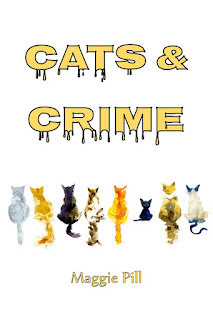
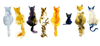
Choose a Cover
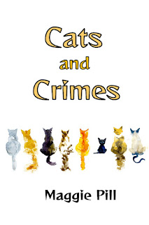
Update on this post: I found that most people didn't like the drippy letters. Sometimes I get excited about something that's "different" and don't realize that it's kinda weird. I went back to the drawing board and got almost 100% consensus on a new version, so here it is. It's neater, but I like that the pointy lettering is reminiscent of cat teeth/claws. Thanks to all who gave ideas and opinions. Today I'm looking for opinions on covers for the next book, scheduled for November release. I like the fancy font stuff, but I admit the plain is easier to read. Imagining that most people will see this online, as a thumbnail, which cover takes your eye? Or make a suggestion. I'm interested.