Okay, THIS Is the Last One
Second, the character in the title is unique, which at first made me want to picture her on the cover. I started by choosing a photo of a little girl who looks slightly dangerous. But several fans said they'd rather create their own image in their minds, and once I thought about it, I had to agree. Who hasn't been disappointed with a movie that turned a favorite character into someone you didn't recognize? I love Matthew McConaughey, but he didn't fit my image of Dirk Pitt at all. And of course there's Tom Cruise as Jack Reacher...
So here's the pic I thought would work.
It didn't.
Cover artists say it's a mistake authors often make, and authors can't blame them if the cover fails. Their job in the case of indie authors is to do what they're told. I had much less input into covers when I was traditionally published, which was both bad and good. The historical accuracy was awful, but the cover, which I would never have chosen, appealed to readers of the genre.
Authors tend to want covers to represent the story in pictures, but that isn't what readers react to. Instead, artists use color, style elements, and fonts to evoke the genre, the mood, and the unique elements of the story. Readers are meant to react to the stylistic elements before they ever touch the book, read the back, or peruse the pages.
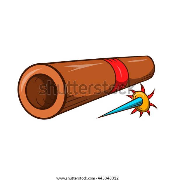
Another thing cover artists know is to not include too many elements on the cover. Everything should send the reader a message, but the message should be fairly simple, That meant my suggestions for a bunch of weapons scattered around the cover went the way of the girl with the slingshot. What does a blowgun mean to a person who doesn't know that Lucy grew up in the Amazon Rainforest?

I do have a caveat, and if you wonder why I don't always accept what I'm first offered, here it is: No one agrees on what a perfect cover is. I once read a long article from a cover artist who showed you "good" covers and "bad" covers, giving examples of each. The first comment he got was, "The cover you said was horrible is my favorite of all the ones you showed." I've had a few cover artists who read the book before designing the cover, but that's pretty time-consuming. Most want a blurb and a few suggestions. And like other experts, cover artists are bothered by things that don't bother the general public. Fonts are important, but how many people even know there are fonts especially made for cover art? I didn't. And there are even a few readers (like me) who will buy a book even when they hate the cover. (Mr. Penumbra's 24-Hour Bookstore is an example. Hated both covers. Bought the book because I liked what the blurb said.)
When I shared samples of covers I was considering, I got "I like this" is often followed by someone else's "I hate that." So while authors are probably too close to the story, cover artists can sometimes get too cute. I once had a cover that I accepted, trusting the artist's judgment, until I tried to sell it and people said, "Oh, young adult!" Um, no. New cover, please!
If we're lucky, we get some good advice in with all the opinions. Several times when I've submitted cover ideas that artists give me, someone with the "eye" points out specific things or makes suggestions. With this one, I got help from an artist who liked the idea of a simple cover. She suggested just two elements to generate interest: the spider and the halo. It felt right, and that's what I went with in the end.
CUTEST LITTLE KILLER is up for pre-order at most sites. It releases on July 13 in print and e-book formats. I think you'll enjoy meeting Max and Lucy, and I hope you like the cover. :)


Comments
Post a Comment