New Cover: Full Stop and Hard Turn Right
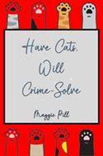
I've been plagued by the cover for the first book of my upcoming new series. In concerns a private detective working with two kids who are uber-smart but were raised in the jungle. They're all fun characters to write, and I hope they appeal to my readers.
The problem was that I didn't like any cover for very long. I'd look at it and think, "That might work," but then a few days later I realized it didn't.
I put two possibilities up for fans to react to, and I got some excellent results. Though they didn't know what it was, I could tell they weren't impressed with what we'd done so far.
When this happens, I have to stop thinking about it for a few days and then...think about it. I discovered that trying to picture the main character, the "Cutest Little Killer," was not going to work, and that's what was making me uncomfortable with what we had.
So.
Here's the direction we're going now, and I'd love some reactions. I think I'm going to go for wider on the title, and I love the little halo on #1, so that's definitely staying. Not sure about the lettering--does the red stand out in #3 or clash? Does the outlining help it be readable? Background: do you like a little texture or plain color?


Comments
Post a Comment